
Quiet Palettes, Luxurious Textures
Today we celebrate neutral color schemes infused with layered, tactile materials to shape sophisticated spaces that feel calm, intentional, and deeply inviting. Expect practical palettes, material pairings, and lighting insights that help your rooms speak softly yet confidently. Bring questions, share photos, and join the conversation as we refine restraint into warmth and craft environments that honor subtlety, comfort, and enduring beauty without sacrificing personality or everyday livability.
Foundations of Calm: Neutrals That Breathe
A neutral palette thrives on nuance: undertones, light direction, surface sheen, and material honesty. By understanding how cream, greige, and taupe shift with sun, lamps, and texture, you can build rooms that feel composed yet alive. We’ll align hues with lifestyle needs, layering finishes that welcome touch and encourage slow moments of quiet appreciation every time you enter.
Tactile Materials That Elevate Restraint
Natural Fibers and Weaves
Linen diffuses light, wool adds plush warmth, and jute grounds the room with earthy stability. Mix open weaves with tight knits to create rhythm. When layering, vary thread thickness and weave density so each textile contributes its own voice. Try a linen slipcover, wool bouclé throw, and flatweave rug, then finish with a lightly nubby pillow for irresistible tactility.
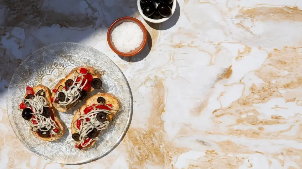
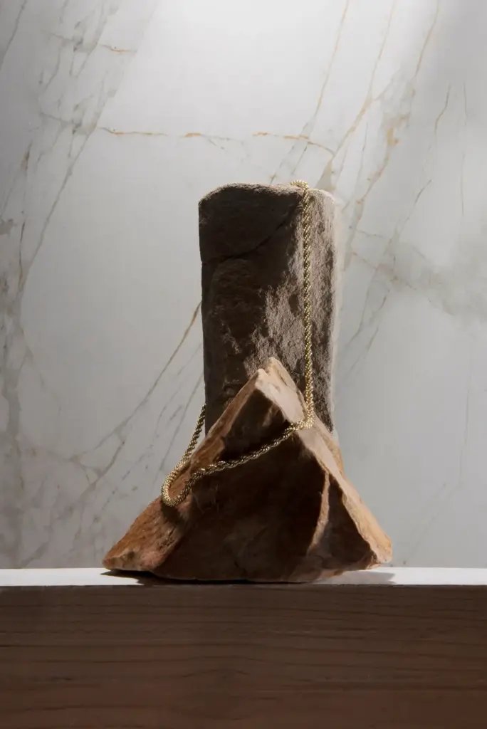
Stone, Clay, and Mineral Surfaces
Travertine’s pores, soapstone’s soft luster, and clay plaster’s velvety irregularities bring soul to hushed palettes. Embrace small imperfections; they reveal time and hand. Combine honed finishes with lightly textured tiles for dimensionality. Keep grout colors close to the base tone so surfaces read as continuous planes, letting shadow and touch become primary storytellers rather than aggressive contrast.
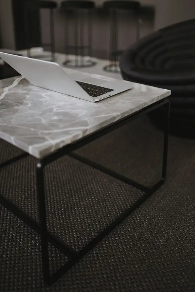
Metals with Soft Presence
Brushed nickel, aged brass, and burnished bronze can feel warm, not flashy, when selected with gentle sheen. Repeat one metal across hardware and lighting for coherence, then introduce a second finish sparingly for depth. Avoid high-polish unless you want deliberate sparkle. Patinated finishes age beautifully, echoing the lived-in grace that makes neutrals feel collected rather than sterile or staged.
Palette Building: From Ivory to Charcoal
Start with three values—light, mid, and deep—to create a calm gradient. Ivory or soft greige on walls, a mid-tone stone or fabric for balance, and charcoal or espresso accents for gravity. Keep saturation low yet distinct. If you crave variety, shift texture, not hue. This method produces generous depth while preserving a serene, whisper-quiet sense of cohesion throughout.
Spaces That Whisper Luxury
Translating neutrals and texture into real rooms means considering traffic, comfort, and maintenance. Living areas need forgiving surfaces and layered lighting. Bedrooms crave seductive softness. Kitchens and baths benefit from tactile contrast and wipeable finishes. Every choice should support everyday rituals while heightening atmosphere, so the home feels both meticulously composed and genuinely lived-in, never museum-quiet or precious.
Living Room Layers
Ground the seating area with a flatweave rug, then add a plush mohair throw for contrast. Choose a sofa fabric with durability and subtle slub, pairing it with linen drapery that moves like breath. Side tables in honed stone or matte wood invite touch. Place dimmable lamps at multiple heights, nurturing conversation while preserving the room’s gentle, cocooning glow.
Serene Bedroom Retreat
Let the bed be a sanctuary of textures: percale for coolness, washed linen for relaxed elegance, and a wool blanket for weight. Keep the palette near-skin tones—creams, sands, misty grays—for maximum rest. Add a tactile headboard, maybe channel-tufted or framed in soft oak. A nubby rug underfoot turns early mornings into small, luxurious moments of grounded quiet.
Kitchen and Bath Cohesion
Matte cabinetry in warm greige pairs beautifully with softly veined stone and brushed hardware. In baths, clay plaster or honed tile counters glare while maintaining practicality. Repeat a wood finish across open shelves and stools for warmth. Keep grout and caulk tones sympathetic, inviting the eye to read surfaces as calm planes rather than busy grids, amplifying soothing continuity.
Art, Objects, and Soft Geometry
Curation becomes storytelling when color sits back. Choose art that leans into texture—charcoal sketches on heavy paper, impasto paintings, or ceramics with hand-thrown ridges. Group objects by tone and finish rather than matching sets. Negative space matters; breathe between pieces. Your restraint invites curiosity, making each detail feel intentional, soulful, and quietly radiant in gentle light.
Care, Longevity, and Conscious Choices
Beautiful neutrals endure when materials suit real life. Choose performance finishes where spills happen, and celebrate patina where age adds charm. Prioritize sustainable sourcing, fair labor, and certifications that mean something. Maintenance routines should be simple and repeatable. Share your cleaning wins and product recommendations below, and subscribe for monthly material guides with field-tested tips from designers and craftspeople.
All Rights Reserved.